Case study — UI/UX Design
OrangePro
In-app notifications, an install tutorial, and the Sketch-to-Figma migration that came with them.
- Two missions, one shared design system
- Accessibility reworked along the way
Several missions ran back to back during my time at Orange Pro: UX work across the whole app, and a major design migration from Sketch to Figma. Two of those missions run through this case study: a notification centre nobody had designed yet, and a tutorial for a feature customers kept installing too late.
Every screen had to sit within Orange's existing brand guidelines and design system, several parts of which got reworked along the way to meet accessibility standards.
- Benchmarked existing notification centres
- Tested with real customers over video calls
- MVP scope re-cut by the feedback
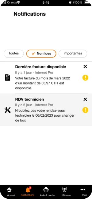
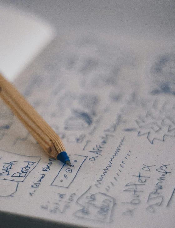
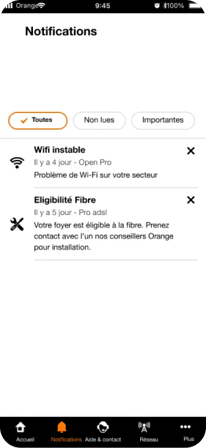
The Orange Pro app had been live for a while, but its in-app notifications had never been used. The first step was studying how other notification centres categorise their alerts. A hundred a day, badly sorted, make an app harder to use than having no notification centre at all.
A first version was sketched, turned into a prototype once validated by the design system team, then tested with real Orange Pro customers over video calls: what they clicked, why, and what they expected. Categories, deleting versus archiving, and how the read state should read were all reshaped by that feedback. Some ideas shipped, others got cut, others got pushed to a later version instead of the MVP.
- Several entry points into the tutorial
- Animations redone frame by frame
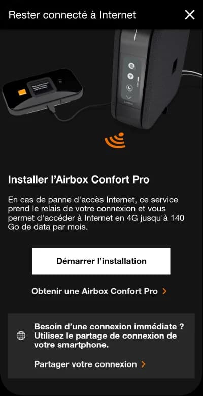
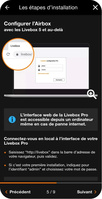
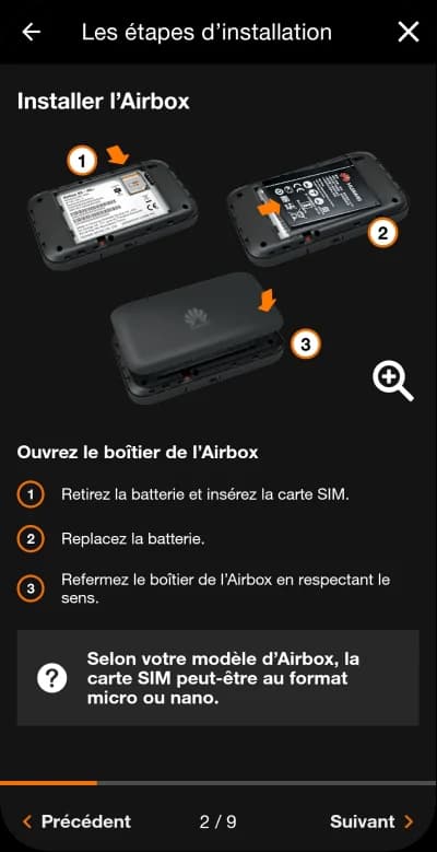
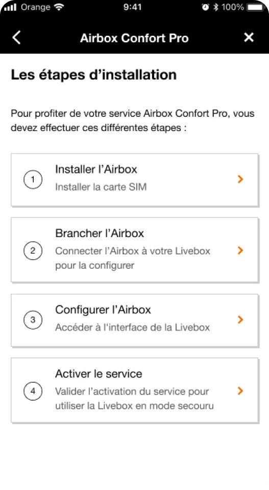
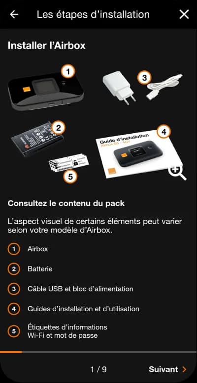
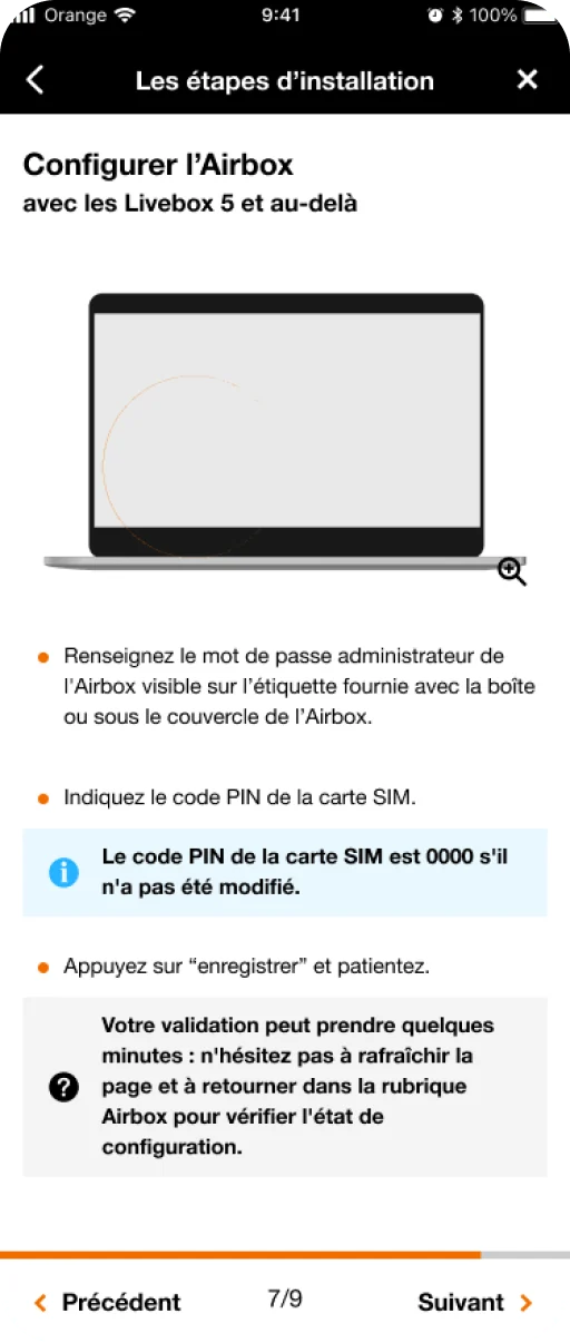
Airbox Pro backs up a business's connection when the network drops, but customers kept putting off the install until the network had already failed, turning a five-minute job into a panic. The tutorial had to make installing it simple enough that it would stop being put off, with several entry points so someone mid-emergency could jump straight to the step they were stuck on instead of replaying the whole thing from the start.
The trickiest part turned out to be the animations. Figma's smart animate looked promising: give it two keyframes and let it interpolate the rest. But exporting a clean GIF out of Figma turned out to be almost impossible, buggy, and the prototype didn't travel well outside the tool. Photoshop's timeline tools, closer to an actual animation tool, ended up doing the job. Every frame was redone by hand there, but the result was worth it. The animation let the tutorial show which harness to plug in rather than write one more paragraph of instructions.
- Triage: rebuild, clean up, or archive
- Components rebuilt by hand
Orange finally moved its design system, prototypes and mockups from Sketch to Figma. By a strange coincidence, I'd built part of that same design system in Sketch during an earlier internship, so a year later I came back to migrate it.
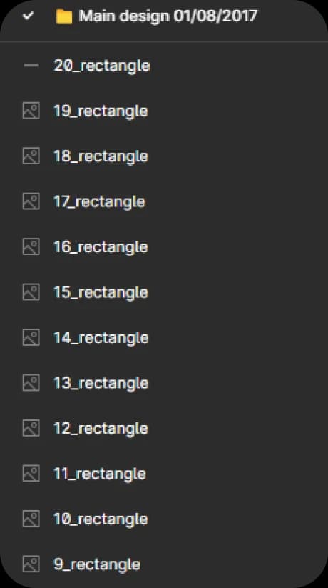
Opening a Sketch file straight in Figma looks simple: it isn't. Every file got sorted into three tiers depending on what it deserved: a full hand rebuild for anything still actively in use, a raw import with a light clean-up for archives that just needed to exist somewhere, and an export to a ready image for anything unlikely to be touched again. Components themselves still had to be rebuilt by hand, but once a component existed, every designer on the team could reuse it, which is what actually made the migration possible.
Helvetica
Two features Orange Pro users never had before: a notification centre, and a tutorial that actually gets the Airbox installed on time, both shipped within the same guidelines the rest of the app already used. And underneath both, a design system that finally lives in one tool instead of two, so the next designer to open this app isn't stuck reopening a broken Sketch file to work out what a component was meant to look like.
UI/UX Design — Cillian Heffernan · Orange Pro design system team